Tools
Figma, Miro
Timeline
March 2024 - May 2024
Focus
Color System, Accessibility, Design System
Overview
When Identity Meets Usability
Designing for Yale came with a unique challenge, crafting an accessible UI while staying true to the brand.
At the heart of this task? Yale’s iconic yellow, a color that exudes energy but poses real challenges in digital accessibility.
How could we create a design system that’s inclusive, readable, and still unmistakably “Yale”? That’s the balance we set out to achieve.
Identify the Problem
The Yellow Problem
Yale’s signature yellow is bold, attention-grabbing, and deeply tied to the brand’s presence. But when it comes to digital interfaces, what makes yellow iconic can also make it problematic.
As we worked to make Yale’s digital experiences more accessible, we had to carefully navigate three critical considerations:

Accessibility
Great for branding, hard on the eyes in digital contexts. Yellow often lacks sufficient contrast, especially on light backgrounds.

Brand Identity
Yellow is non-negotiable, it’s a core part of Yale’s visual DNA. Altering it was not an option, so our system had to adapt around it, not away from it.

Visual Balance
Used without restraint, yellow can dominate layouts and distort the visual hierarchy. We needed a strategy to keep it powerful, but not overpowering.
Explore Solutions
How Do Other Brands Handle Bold Colors?
Before jumping into solutions, we zoomed out:
How do other yellow-heavy brands manage it?
Where does yellow succeed, and where does it fail, in digital products?
We audited major brands to analyze color application strategies in UI and accessibility contexts.
Key takeaway?
Yellow needs a support system. Without contrast, it can’t do the heavy lifting alone.
Define Principles
What Rules Keep the Brand Intact and Accessible?
Since changing the yellow itself was off the table, we crafted a usage strategy, design rules that turned limitations into a creative framework:
No Foreground Yellow
Yellow should never be used for text or crucial foreground UI on light backgrounds.
Accompanied by Dark Elements
To ensure clarity, any yellow UI element was always paired with a darker color through text, borders, or icons.
Build the System
Design System Implementation
1
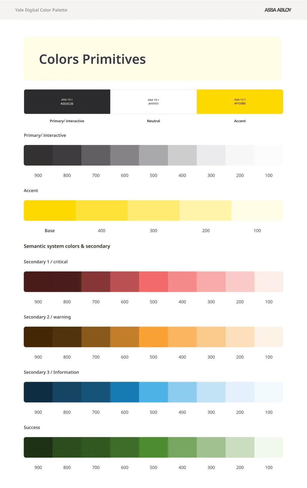
Color Primitives
Developed design system color primitives, defining the color system by introducing supporting shades of gray to balance the strong presence of yellow, while also establishing semantic colors.
2
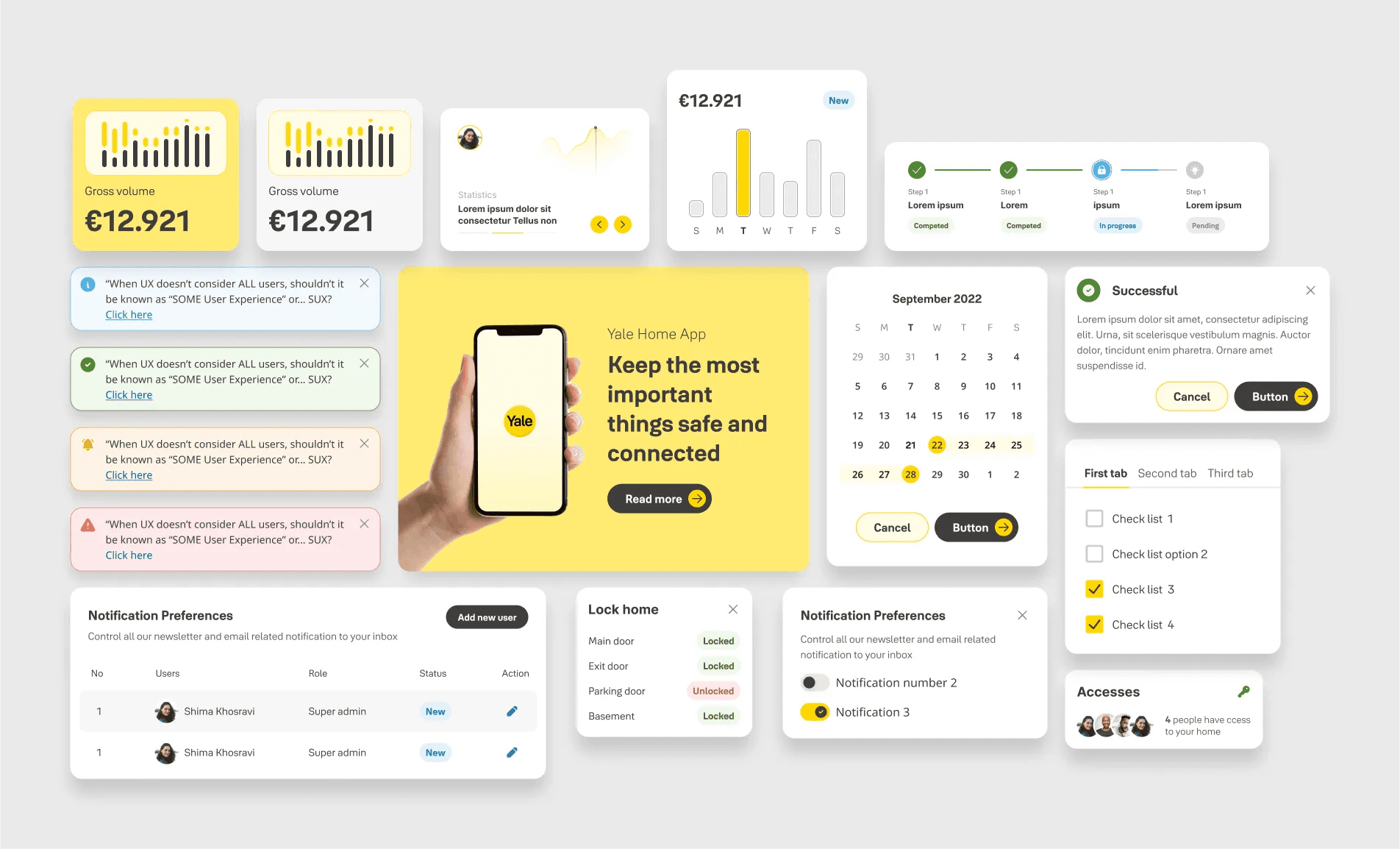
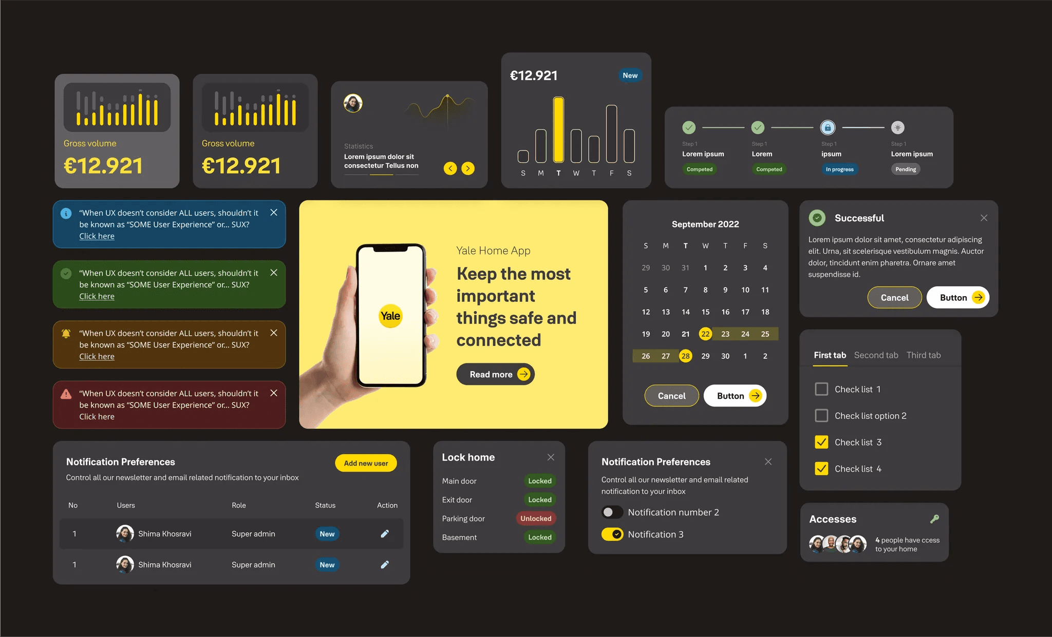
Components That Comply
All core components were built using the new palette: buttons, alerts, banners, navigation, and more , tested thoroughly for WCAG 2.2 compliance.
3
Real-World Validation
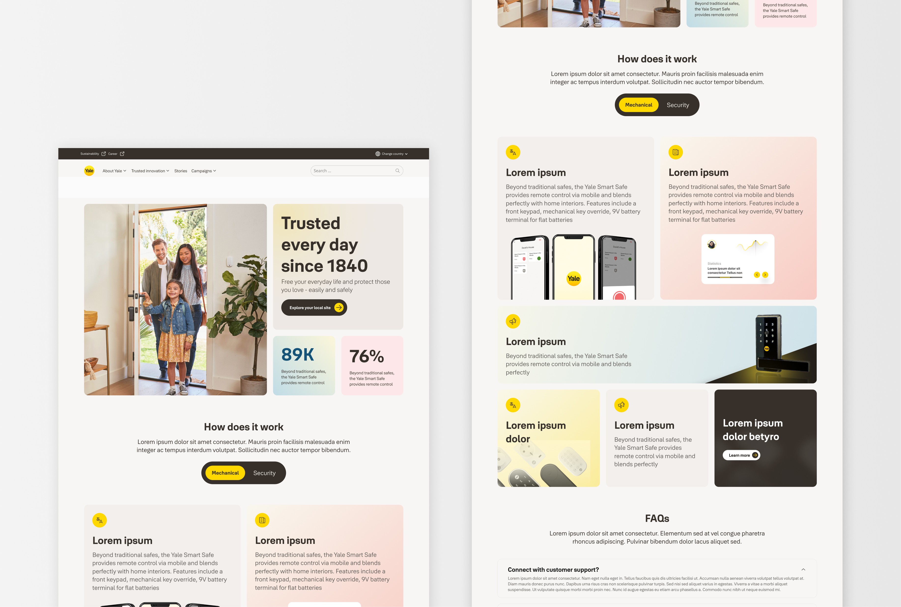
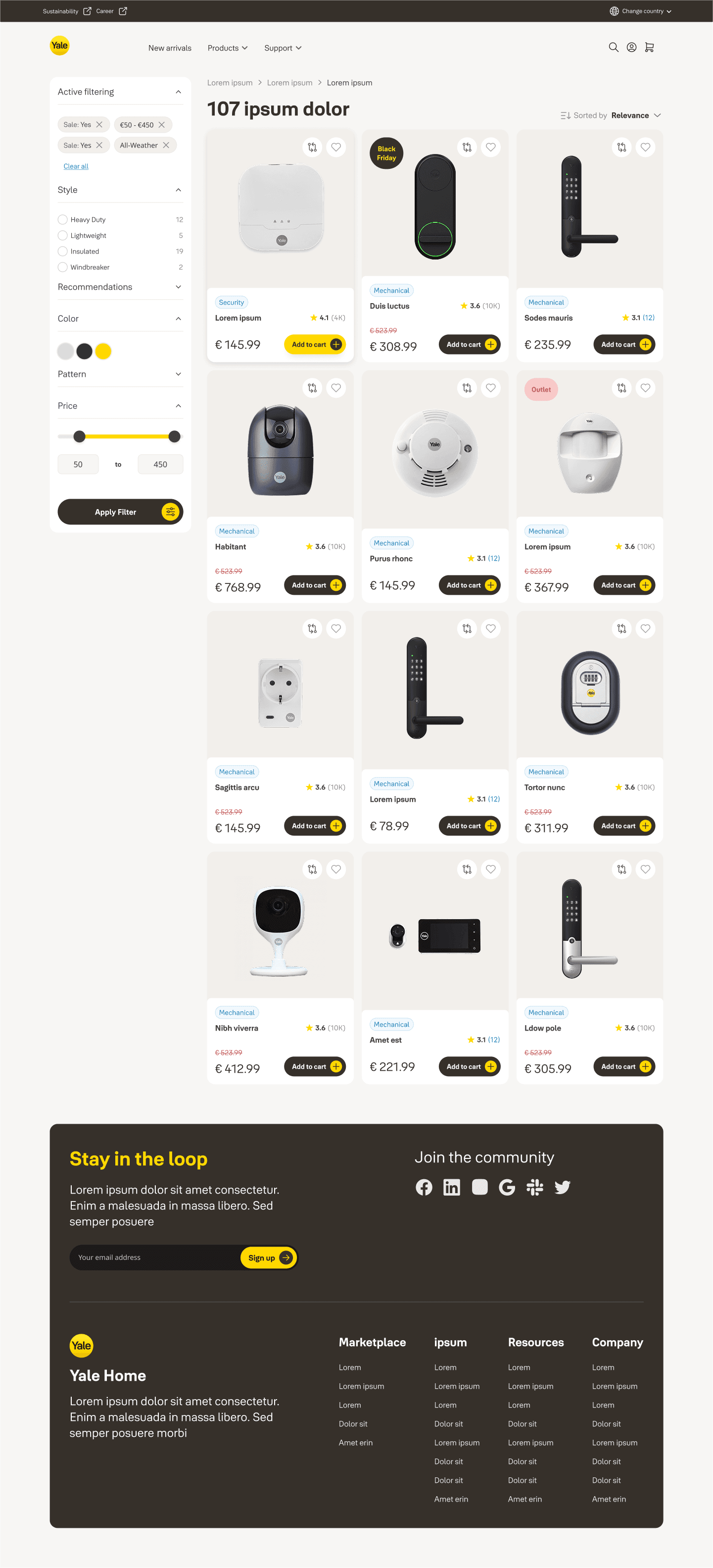
We applied the system in a eCommerce showcase, simulating shopping flows, CTAs, and product displays to ensure scalability and user-friendliness.


Impact
Results & Value Delivered
Through this work, the new Yale Design System:
Preserved brand identity without compromise
Improved accessibility and clarity across interfaces
Enabled consistency and reusability for developers and designers