This project outlines the design of the “Contact Us” experience across all ASSA ABLOY divisions, a global leader in access solutions. Customers struggled to find the right information due to inconsistent layouts, outdated content, and unclear contact details, resulting in frustration and lost opportunities. The goal was to create a clear, consistent, and user-friendly experience that makes it easy for users to get the help they need, while supporting the unique needs of each division.
Tools
Figma, Hotjar, Miro, Userlytics
Timeline
August 2024 - December 2024
Team
2 Designers, 1 PM, 5+ Developers
The Challenge
How might we design an effective user-friendly, and consistent Contact Us experience across all ASSA ABLOY divisions while ,meeting the unique needs of both users and the business in each divisions.
My Role
Discovery, User Research, Workshop Facilitation, Analysis, Conceptualization, Prototyping, Testing, Visual Design, Communication
Context
ASSA ABLOY is a world leader in access solutions, helping people move safely and securely through homes, businesses, and institutions.
It operates through different divisions, each focused on specific regions or solutions, here’s an overview:

TL;DR – The Solution

Defining the Gold Standards
Best Practice Checklist
A universal guide outlining the nice-to-haves and must-haves for an effective Contact Us page.
Contextual Playbook
A tailored approach considering the unique needs of ASSA ABLOY’s users and business goals.

Creating the building blocks
We designed customizable building blocks and components for the Contact Us experience, so teams could tailor them to their needs while keeping things consistent across the organization.

Driving Adoption & Impact
A great solution means nothing if it isn’t used. We worked closely with divisions, presenting the solution, running hands-on sessions, and helping them tailor it for their unique challenges and test it, ensuring real change, not just recommendations.
Understanding the Problem

Business Problem
Hard to Do Business With
The Brand Awareness Report showed customers found ASSA ABLOY hard to work with.
Inconsistent Experience
Inconsistent Contact Us experiences across divisions led to missed opportunities and a lack of user engagement.

User Problem
Constraints

Time
We had to deliver a solution within 3 months, by the end of Q4.

Limited User Access
We didn’t have access to users from all divisions.
Discovery & Research
1
Current Solutions Discovery
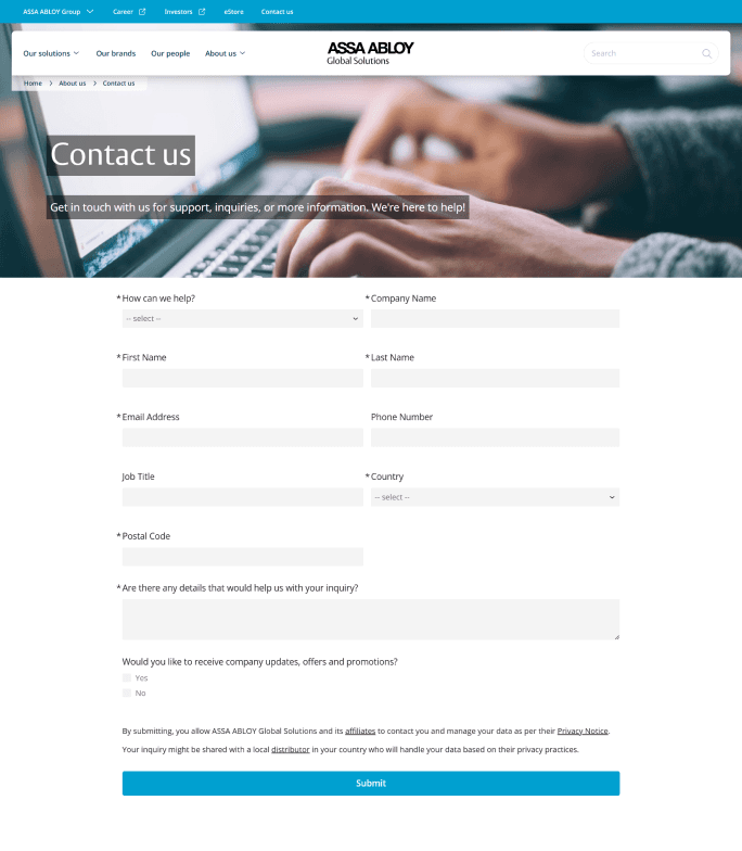
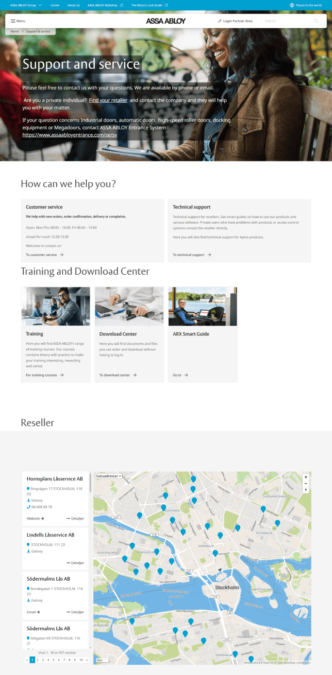
We kicked off the process with a comprehensive experience review of the current experience.

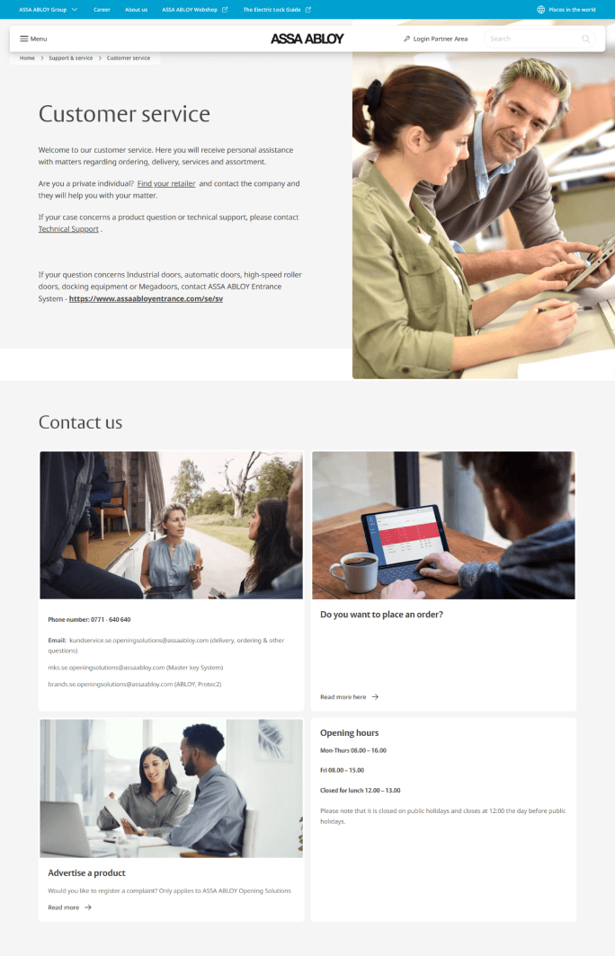
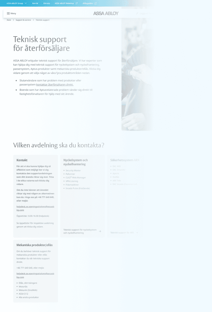

Key Takeaways

Lost in Navigation
Poor navigation makes finding support frustrating
Missing Contact Link
No consistent, easy-to-find "Contact Us" link in the main navigation
Clunky Contact Forms
Contact forms ask for too much info and lack confirmation messages
Information Overload
Too many contact options and irrelevant details confuse users
No Quick Answers
No self-service options like FAQs, forcing users to reach out for simple questions
2
User Interview & Hotjar Feedback Analysis
We interviewed users and analyzed Hotjar data to uncover the pain points and frustrations users face across different divisions.

The main issues we identified were confusing navigation, difficulty finding relevant contact information, and slow or no responses when users reached out.


3
Internal Interviews & Lead Management Analysis
After uncovering major user frustrations, we looked behind the scenes to see how inquiries were handled.

How are inquiries actually being handled within the organization?
We spoke with teams across divisions, mapping the process from submission to prioritization, assignment, and response.
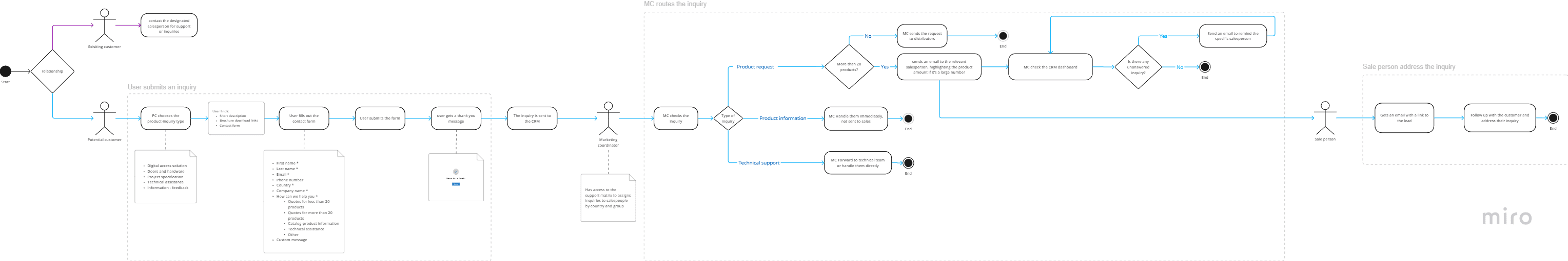
Key Takeaways
No confirmation message or timeline left users unsure of what to expect
One person managed all inquiries, causing bottlenecks
Poor lead categorization meant urgent requests weren’t prioritized
No tracking system led to unanswered inquiries being overlooked
Lack of clear ownership caused some inquiries to fall through the cracks
No analytics made it difficult to measure response times or user satisfaction
A generic form for all inquiries made it hard for users to get relevant help
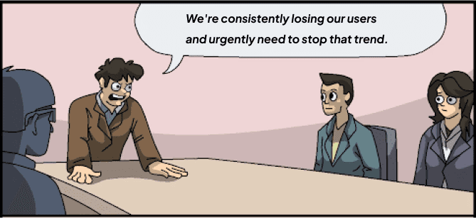
Defining the Problem
The problem was clear, but the path forward wasn’t!
To find the right path forward, we brought together stakeholders from different divisions for a problem-framing workshop.
20 Stakeholders

90 Minutes

Mountain of Topics
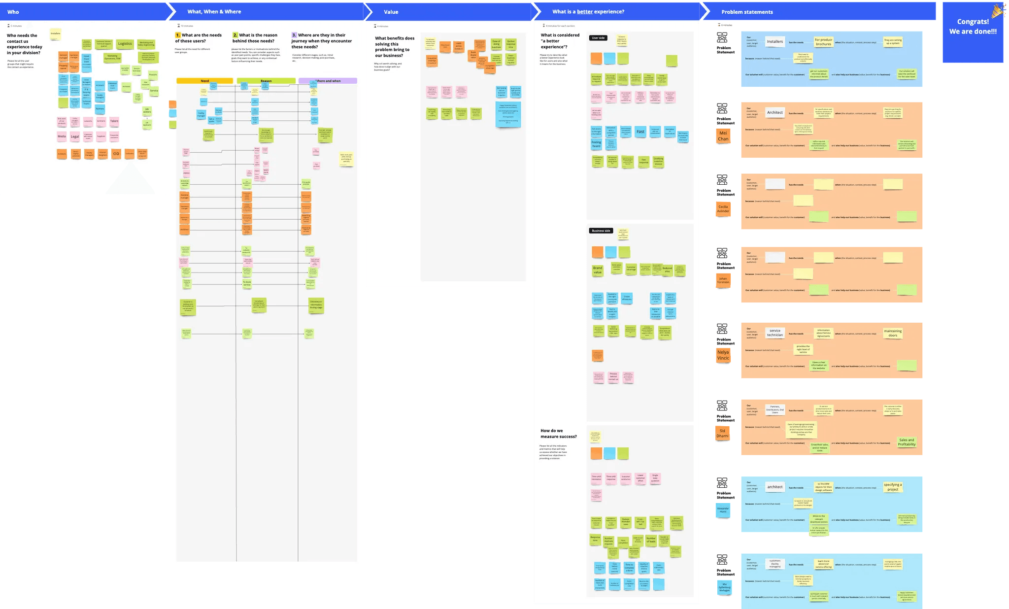
What We Set Out to Achieve
Pinpoint exactly who we were solving this for.
Understand the underlying reasons behind different user needs.
How solving this problem aligns with our business goals.
Define what a better experience should look like, for both users and the business.
Establish clear success metrics to track progress.
During the workshop, we dissected a broad problem statement into key components to sharpen our focus.
How might we provide a better contact us experience [?] for [who] needing [what] at [when and where] in order to [why]?
By the end of the workshop, we had a clear direction on what to prioritize and measurable success metrics to track our progress.
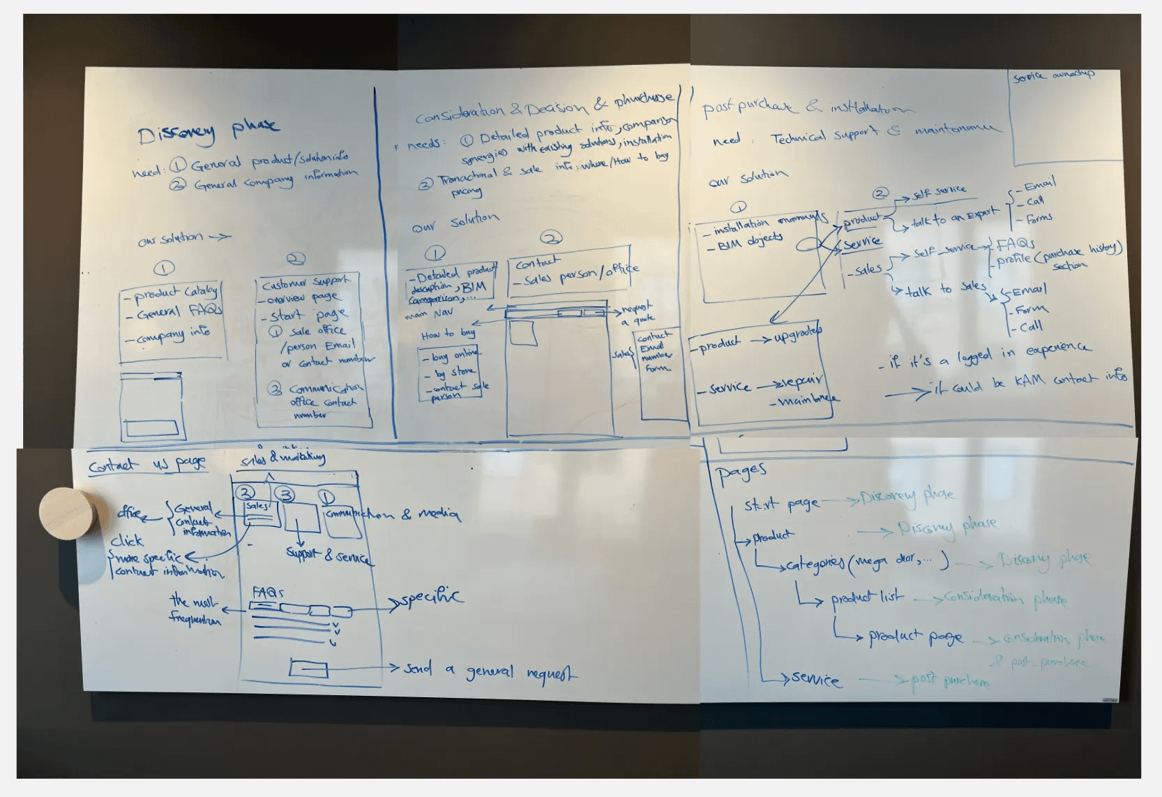
Laying the Foundation

1
User’s Information Need Categories
Product/Solution information
Users seeking general or detailed insights on products and solutions, comparisons, and synergies with existing systems.
Technical support and maintenance information
Users needing assistance with installation, troubleshooting, maintenance, and upgrades.
Transactional and sales information
Users interested in purchasing products, pricing details, invoicing, and finding local distributors.
Company and organizational information
Users looking for broader company details, including career opportunities and general organizational information.
2
Stages Where Users Seek Help
Awareness and exploration
Users discover ASSA ABLOY's offerings and are open to explore solutions.
Evaluation and decision-making
Users evaluate which solutions best meet their needs, comparing options and conducting in-depth research.
Installation and maintenance
users have purchased and are now focused on the installation, support, and maintenance.
Let’s connect those information...
Bringing the Solution to Life
To make it easier for users to get the help they need, we tackled the solution in two ways:

Helping Users Help Themselves
We needed to make sure the right information was in the right place, so users could easily find answers on their own, without frustration.

Making It Easy to Reach the Right People
When users couldn’t find what they needed, we wanted to ensure they knew exactly where to go. Clear, relevant contact information had to be easy to find.
Here’s a quick look at the three user journey stages, what they need, and how we can best support them, guided by the priorities we set earlier.
We sketched ideas to map out how the information should fit into the general website’s structure, then used dot voting to decide which design to pursue.
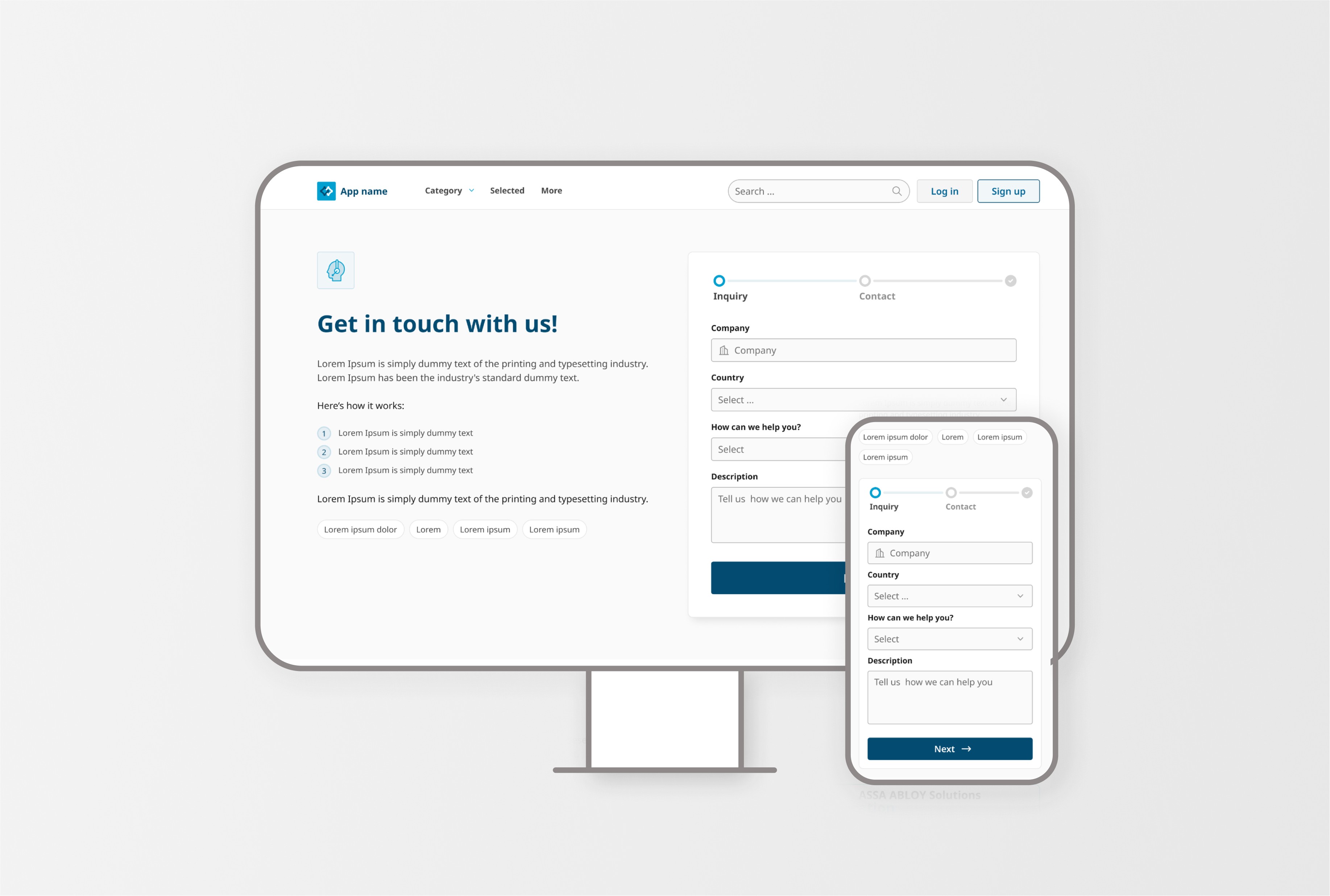
Adaptive Design: Final Deliverables
We designed a flexible yet consistent "Contact Us" experience, ensuring divisions could tailor it to their needs while maintaining a unified structure.
Customizable Components and Patterns
We designed modular components that divisions could use to meet their unique needs, ensuring clarity and ease of use while keeping a cohesive experience across the organization.
Still polishing this up! Sparkles incoming ✨
Ready-to-Use Templates
To simplify adoption, we provided templates that combined the right components for different general use cases like a Contact Us Page, making it easy to build user-friendly pages without starting from scratch.
Still polishing this up! Sparkles incoming ✨
Clear Guidelines
General Guideline: Covers best practices for an effective Contact Us page.
Contextual Guideline: Practical guidance for each stage of the user journey, helping teams provide the right support when it matters most. It also includes a simple framework for tracking success and a guide to keeping customer responses clear, helpful, and empathetic.
Still polishing this up! Sparkles incoming ✨
Refining and Rolling Out the Solution
To validate the solution, we...
Ran usability tests with Userlytics
To see how easily users could navigate and interact with it.
Hosted a webinar for Divisions
To introduce the solution, gather their thoughts, and fine-tune things based on their feedback.
Rolling out a solution isn’t just about delivery, it’s about adoption!
To help divisions bring the solution to life, we held one-on-one sessions tailored to their unique requirements and contexts. We walked through how to apply the building blocks, tweak templates, and make the most of the guidelines.
The Impact
The impact was real... but the words are still catching up. Stay tuned! ✨
What I Took Away!
Show the “why”
I learned that to make a solution actually work, it’s not enough to just show what’s right, you have to show why it matters. People need to see the value, feel connected to it, and feel like they’ve had a hand in shaping it. When they do, they’re more likely to care about the outcome and commit to making it work.
Keep it practical and flexible
I also learned that clarity and practicality win. Even the smartest solution won’t go anywhere if it’s too abstract or hard to implement. Also, designing for a large organization means balancing consistency and customization. You learned to build modular, adaptable components that could work across different contexts while still feeling unified.
Make people part of it
It's not enough to have a smart solution. Teams need to see themselves in it, to feel heard, included, and invested. By involving divisions early, listening closely to their pain points, and iterating based on real feedback, we built more than a solution—we built buy-in.